
Introduction
We create and use huge amounts of data in all areas of life. It’s important to display and understand this information in an easy-to-grasp and meaningful way. Data visualization plays an important role in bridging the gap between raw data and human understanding. It is enabling us to gain insights, make informed decisions, and communicate complex ideas more effectively. That’s why the question of ethics in data visualization is vital!
From tracking global pandemics to understanding economic trends and social patterns, data visualization has become an essential tool in various fields.
However, with great power comes great responsibility. Data visualization impacts our views and choices, so it’s crucial to make sure visuals are truthful, precise, and ethical.
In this detailed blog post, we’ll explore the importance of ethics in data visualization. We will also cover five ethical principles of data visualization and examine examples of ethical and unethical practices. Finally, we’ll share tips and resources for creating effective, ethical visualizations.
The power of visuals in shaping views and decisions
Visuals greatly impact our perceptions and decision-making, as we naturally process images faster than text. Data visualization effectively grabs attention and communicates complex ideas or patterns due to our visual instincts.
Studies reveal that visuals boost our memory and understanding of information. They help us identify patterns, trends, and anomalies, simplifying conclusions and making informed decisions. Visuals also evoke emotions and empathy, deepening our connection to data and its consequences.
Given this influence, we must recognize the potential outcomes of their work. How data is displayed can affect perception and interpretation, and influence decisions based on that data. By carefully choosing charts, colors, scales, and other elements, we can clarify or confuse the message, guiding or misleading viewers.
This highlights the need for ethical principles in data visualization. The idea here is to ensure visuals are not just eye-catching but also honest, accurate, and unbiased. By embracing ethical practices, we can establish audience trust, foster a well-informed society, and encourage responsible decision-making.
The need for ethical considerations in dataviz efforts
As data visualization gains prominence in our data-driven world, the need for ethical considerations becomes increasingly important. Ethics in data visualization and its considerations are crucial in ensuring that visual representations of data are accurate, fair, and unbiased. As such, they are fostering trust and responsible decision-making.
When data visualizations are created without regard for ethical principles, they can lead to misinterpretations, misinformation, and potentially harmful situations.
There are several reasons why ethical considerations are essential in data visualization.
Why do we need ethical principles in data visualization?
They are summarized in the following five ethical principles in data visualization.
- Accuracy and honesty – Data visualizations should correctly represent the underlying data and not deliberately mislead or deceive the audience. Manipulating visuals to create a false impression or support a specific agenda, erodes trust and leads to poor decision-making.
- Clarity and simplicity – Visualizations should be designed to make the data easier to understand, avoid unnecessary complexity or clutter. Striking a balance between aesthetics and functionality is key to ensuring that the message is clear.
- Fairness and objectivity – Data visualizers should strive to present data objectively, without introducing personal bias or promoting stereotypes. Being transparent about data sources, methodology, and limitations can help establish credibility and promote fair interpretation.
- Privacy and trust – Respecting the privacy of individuals and organizations is critical when visualizing data. We should be mindful of potential privacy concerns and adhere to relevant laws, regulations, and ethical guidelines to protect sensitive information.
- Inclusiveness and accessibility – Ensuring that data visualizations are accessible and inclusive to diverse audiences is an important ethical consideration. This includes using color schemes readable by individuals with color vision deficiencies. It also can mean providing alternative text descriptions (alt text) for visually impaired users. It also means considering cultural sensitivities when designing visuals.
Each of these principles, within the context of dataviz ethics, will be discussed in greater detail later in this article.
Understanding ethics in data visualization
The role of ethics in data viz discipline
Ethics play a vital role in data visualization. It guides the principles and practices that ensure visual representations of data are truthful, fair, and responsible. Since visuals shape our views and guide decisions, data visualizers need to follow ethical standards for clear and unbiased data communication.
Ethical factors in data visualization cover many issues like data honesty, visual clarity, fair representation, and privacy respect. By sticking to these rules, data visualizers build trust and credibility while effectively sharing complex ideas.
Ethics also matter during the whole data process, from gathering and analyzing data, creating graphics, and the final visual. Ethical aspects should be considered at each step, as biases or errors can harm the visual’s integrity and effectiveness.
Furthermore, ethical obligations extend to visualization consumers, who should remain vigilant against potential manipulation and assess information accuracy judiciously.
Finally, the role of ethics in dataviz is ensuring that we create and use visuals that are honest, accurate, and fair. As such, they will be promoting responsible decision-making and contributing to a more informed and ethical society.
The three basic steps in data visualization and their ethical considerations
Data collection
Data collection is the first stage in the data visualization process, where relevant and accurate data is gathered from various sources. This essential step forms the foundation for subsequent analysis and visualization.
Data can be collected from primary sources, such as surveys, interviews, or experiments. Also, it can be gathered from secondary sources, like databases, published research, or government reports. In some cases, data may also be obtained through real-time sources, such as sensors or social media platforms.
The two main ethical considerations in this phase are:
- Ensuring data accuracy and completeness – Data collectors must strive to gather high-quality, reliable data to avoid misrepresentations or misleading conclusions. This may involve cross-checking sources, verifying data authenticity, or addressing potential gaps in the dataset.
- Respecting data privacy and consent – When collecting personal or sensitive information, we must privacy regulations and get informed consent from data subjects. This involves being transparent about data usage intentions and safeguarding collected data to prevent unauthorized access or misuse.
Data analysis
Data analysis involves examining and processing collected data to uncover trends, patterns, or insights that will inform the visualization. This step is essential to transforming raw data into meaningful information.
Data visualizers (designers, developers, journalists…) may use various techniques in their work. Those techniques are descriptive statistics, data cleaning, data aggregation, or even more advanced analytics methods like machine learning. They help reveal meaningful patterns or relationships within the data.
Ethical considerations during data analysis include:
- Minimizing biases and errors – Experts should use appropriate methods, tools, and techniques to reduce biases and errors during data processing. This involves critically evaluating data quality, being aware of potential pitfalls, and validating analytical results.
- Transparency in data processing – Analysts need to be transparent about the steps, assumptions, and methodologies used during data analysis. This enables others to verify, replicate, or challenge the results, promoting accountability and trust in the findings.
Data visualization (design)
Data visualization is the final step in this journey. It involves creating visual representations of data that effectively communicate insights, patterns, or trends to an audience. Designers utilize various forms, such as charts, graphs, maps, or interactive visualizations, to make complex data more accessible and understandable.
Good design choices, including colors, scales, and layout, play a significant role in conveying the intended message and influencing viewer interpretation.
The main ethical considerations during data visualization design include:
- Honest data presentation – Designers must avoid manipulating or distorting data to mislead or misinform viewers. This involves choosing appropriate chart types, scales, and data transformations that accurately show the underlying data.
- Accessible and inclusive design – Designers should create visuals suitable to diverse audience needs and preferences. By doing so, it is ensured that the information is accessible to as many people as possible. This may involve considering color blindness, screen reader compatibility, or providing alt descriptions for visual elements
Five ethical principles in data visualization
We mentioned them earlier, and in this section we’ll go deeper into each of the five ethical principles in data visualization.
The five ethical principles in data visualization are:
- Honesty and accuracy
- Clarity and simplicity
- Fairness and objectivity
- Respect for privacy and confidentiality
- Cultural sensitivity and inclusivity
#1 Honesty and accuracy
Being honest and accurate in data visualization means presenting data truthfully, without distortion or manipulation.
This involves using the correct data, avoiding cherry-picking or misrepresenting information to support a specific viewpoint. Honesty and accuracy build trust with the audience, ensuring that the visualizations effectively convey the intended message. To maintain honesty and accuracy, designers should verify data sources, cross-check information, and be transparent about data limitations or uncertainties.
#2 Clarity and simplicity
Clear and simple visualizations make complex data more understandable and accessible. Clarity and simplicity involve choosing appropriate chart types, using consistent and readable fonts, and organizing the layout for easy navigation.
Simplifying visuals helps the audience to quickly grasp key insights, patterns, or trends without confusion. To achieve clarity and simplicity, designers should prioritize essential information, minimize visual clutter, and use colors, labels, and legends effectively.
#3 Fairness and objectivity
Fair and objective data visualizations avoid biases and present data impartially. This principle ensures that visualizations don’t favor a particular viewpoint or mislead the audience with biased interpretations.
Fairness and objectivity involve selecting unbiased data sources, acknowledging data limitations, and presenting alternative perspectives when appropriate.
To achieve fairness and objectivity, we must be aware of biases in data at every step. That includes collection, analysis, and the actual design and presentation work, and take steps to minimize them.
#4 Respect for privacy and confidentiality
Respecting privacy and confidentiality in data visualization means protecting sensitive or personal information.
This principle ensures that visualizations don’t violate privacy rights or expose confidential data. Respecting privacy and confidentiality involves anonymizing data, aggregating information to a safe level, and obtaining consent when necessary.
To maintain privacy and confidentiality, designers should follow relevant data protection regulations, guidelines, and best practices throughout the visualization process.
#5 Cultural sensitivity and inclusivity
Cultural sensitivity and inclusivity in data visualization involve considering diverse audience needs, preferences, and backgrounds.
This principle ensures that visualizations are accessible and respectful to people from various cultural, linguistic, or ability backgrounds. Cultural sensitivity and inclusivity may involve using appropriate colors, symbols, and language to avoid offending or excluding viewers.
To promote cultural sensitivity and inclusivity, we need to research our audience and seek feedback. And not just that – we needt o be open to adjusting our work to accommodate diverse perspectives.
The Hippocratic Oath for dataviz: A commitment to ethical practices
Jason Moore, who’s now a Senior Computer Scientist at the Air Force Research Lab, proposed a version of the Hippocratic Oath for data visualization. It was first introduced at VisWeek in 2011 and then published on Robert Kosara’s blog.
With some modifications, here’s the Hippocratic Oath for data visualization:
“I shall not use visualization to intentionally hide or confuse the truth which it is intended to portray. I will respect the great power visualization has in garnering wisdom and misleading the uninformed. I accept this responsibility willfully and without reservation, and promise to defend this oath against all enemies, both domestic and foreign.”
Real-life examples of unethical data visualization practices
Ethical practices are essential to ensure that information is presented honestly, accurately, and without bias.
However, not all visualizations adhere to these principles. That results in misleading or deceptive representations that can distort the audience’s understanding and lead to uninformed decision-making.
In this section, we will explore real-life examples of unethical data visualization practices. We’ll highlighting instances where misleading visuals, data manipulation, and inappropriate visual elements have been used to mislead and confuse.
Learning from these cases, we can raise awareness of the potential pitfalls in data visualization. Moreover, we can emphasize the importance of adhering to ethical principles in creating and consuming visual representations of data.
Misleading or deceptive visualizations
A classic example of misleading visualization is the use of truncated or manipulated y-axes in bar charts or line charts. By adjusting the axis scale, a designer can make small differences in data appear more significant, leading to incorrect conclusions. For example, a company may use a truncated y-axis to exaggerate its growth. Or, to downplay a competitor’s performance, misleading investors or customers.
Gun deaths in Florida
Initially, this chart might make you think that with the introduction of the “Stand Your Ground” law, the number of gun deaths in Florida dropped significantly.
But take another look at the Y-axis. Do you see it? For some reason, the values are ordered in an unusual way – with the highest values at the bottom of the axis and the lowest values at the top.
Most people’s first reaction to this would be that the introduction of this law caused a drop in the number of gun deaths in Florida, not the other way around.
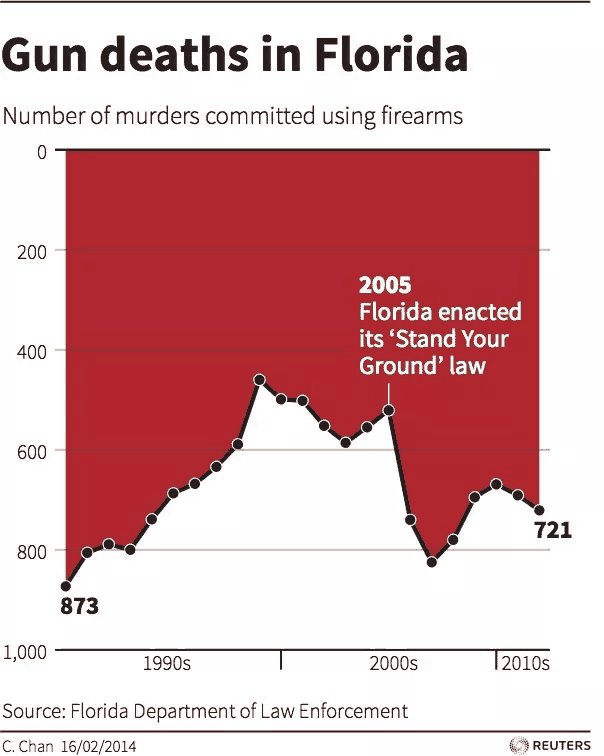
The author, Christine Chan, has tried justifying her decision in a tweet that has since been removed:
@john_self Thanks for the feedback. I prefer to show deaths in negative terms (inverted). It’s a preference really, can be shown either way.
And while it’s likely that she didn’t have an intention to mislead, the impression left made a damage.
People on welfare vs full time jobs
A truncated (or completely missing) Y-axis is the main reason for confusion here. By omitting baseline values and the scale, the difference between the number of people on welfare and those with a full time job seems more drastic than it really is. Bar graph is an appropriate choice for this type of data but it’s missing correct Y-axis.
Adding a meaningful Y-axis with values and a proper scale would help paint a more objective picture here.

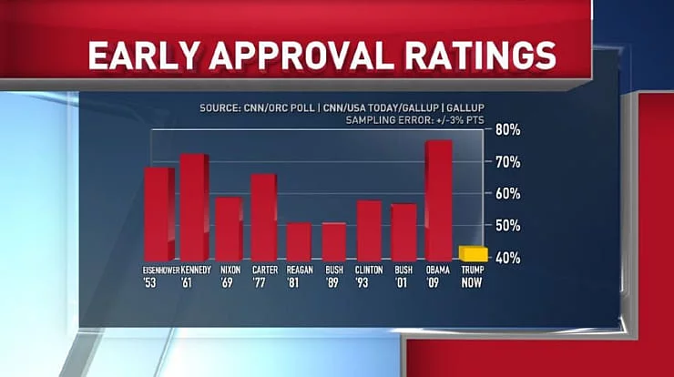
CNN’s bar chart shows presidential approval rates
Again, truncated Y-axes give the feeling that the differences between different presidents are even more apparent in this poorly designed piece by CNN. The source is subreddit /dataisugly.
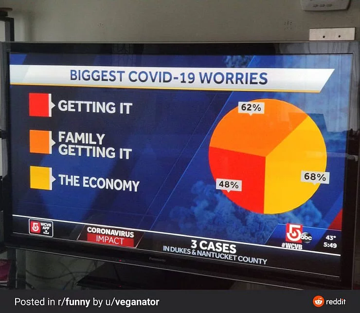
Something doesn’t add up – biggest COVID worries
The sum of all percentages in this case is well over 100%. One doesn’t need to be a data scientist to see that something is off here. Using a pie chart to display percentages is meaningful in many situations, but not every dataset is suitable for it.
In this instance, respondents had the option to choose multiple answers. For example, one might be concerned not only about getting infected themselves but also about their family members becoming infected.
Additionally, it is common practice for the legend to follow the order of pie slices and to have the largest pie slice start at 12 o’clock, proceeding clockwise. In this example, “Getting it” is the first label in the legend section but appears second, regardless of whether we go clockwise or counterclockwise.
Other unethical approaches to data visualization
Manipulation of data to support a specific agenda (cherry picking)
Selectively presenting data points or time periods that support a specific narrative, while ignoring contradictory or less favorable information, can distort the audience’s understanding of an issue.
An example of data manipulation can be seen in the selective presentation of data to support a political or social agenda.
A political group might cherry-pick data points that show a positive trend for their policies. At the same time they would be ignoring negative trends or omitting relevant context. This manipulation can mislead the public and distort their understanding of the issue, promoting a biased perspective.
Inappropriate use of visual elements that trigger bias or stereotype
In 2015, the New York Times published an infographic titled “Murder in America” that aimed to show the relationship between race and homicide victims. However, the visualization faced criticism for perpetuating racial stereotypes. The chart used red dots to represent black victims and blue dots for white victims, with red dots appearing more prominent and alarming. Critics argued that the choice of colors could reinforce negative stereotypes about African Americans and crime. Furthermore, the chart lacked context and socio-economic factors that contribute to crime rates, providing a simplified and potentially misleading view of a complex issue.
It has been removed since.
Ignoring data uncertainty
Ignoring data uncertainty in visualizations can lead to misleading representations of information, causing audiences to develop a false sense of precision and reliability. It’s one of the most overlooked situations and it can happen in a number of cases.
- Election polls and forecasts – During election seasons, various organizations provide polling data and forecast models to predict election outcomes. Failing to include margins of error, confidence intervals, or uncertainty ranges in these visualizations can give the impression that the predictions are more precise and certain than they actually are. This might lead audiences to be overconfident in the forecasted results, which can affect their voting behavior or expectations.
- Scientific research – In fields like medicine or climate science, research findings often include inherent uncertainty due to factors like sample size, measurement errors, or model assumptions. When visualizing these findings, it’s crucial to include error bars, confidence intervals, or other visual cues that represent the uncertainty. Omitting these elements can create a misleading impression of the findings’ certainty, leading to misinformed decisions by policymakers, healthcare professionals, or the public.
Confusing area and radius in scatter plots
An unethical approach in data visualization can involve the inappropriate use of bubble size in scatter plots, causing confusion and misinterpretation of the data.
In scatter plots with bubbles, the size of the bubbles often represents a third variable in addition to the two variables plotted on the x and y axes. However, when the bubble sizes are not scaled properly, it can create misleading impressions about the relationships between variables.
For example, let’s consider a scatter plot that compares a country’s GDP per capita (x-axis) with life expectancy (y-axis), using bubble size to represent the total population. If the bubble size is scaled by radius, rather than area, it can create a distorted perception of the population sizes. Since the area of a circle increases with the square of its radius, a bubble with twice the radius would represent a population four times larger, not twice as large as one might assume. This can lead audiences to overestimate the differences in population between countries.
Strategies for ethical data visualization
Data visualizers must use particular techniques and strategies that encourage ethical decisions throughout the design process to produce visuals that uphold ethical principles.
In this section, we’ll go over four essential strategies for creating ethical dataviz:
- exercising critical thinking and challenging the data source
- selecting the best type of visualization for the intended audience
- achieving a balance between form and function
- ensuring accessibility and inclusivity
Critical thinking and questioning the data source
To ensure the accuracy and honesty of a visualization, it is crucial to critically examine the data source.
Start by assessing the credibility and reliability of the source, and consider potential biases or errors that may be present. Be transparent about the limitations of the data and any assumptions made during the analysis. When working with multiple sources, cross-reference and verify the information to minimize the risk of inaccuracies.
Additionally, be open to feedback and willing to revise the visualization if new or contradictory information emerges.
Choosing the right visualization type for the message
Selecting the appropriate visualization type is essential for effectively communicating the message and avoiding misinterpretation.
Begin by understanding the data and identifying the key insights you wish to convey.
Then, choose a visualization type that best represents these insights.
Do it by considering factors such as:
- the nature of the data (categorical, numerical, or time-based)
- relationships between variables
- the audience’s familiarity with different chart types
Avoid using misleading or overly complex visualizations that may distort the message or confuse the audience.
Balancing aesthetics and functionality
While visually appealing designs can capture attention, it is important not to prioritize aesthetics over functionality.
Strive for a balance between the two by creating visuals that are both engaging and easy to understand. Use color, typography, and layout to enhance the clarity of the message. However, avoid unnecessary embellishments or visual clutter that may distract from the data.
Ensure that the design choices support an accurate interpretation of the information and do not introduce biases or misconceptions.
Ensuring accessibility and inclusivity
An ethical visualization should be accessible and inclusive, taking into account the diverse needs and perspectives of the audience.
To achieve this, consider factors such as color contrast, font size, and alternative text for visually impaired users. Use culturally sensitive and neutral language. Also, be mindful of potential stereotypes or biases that may be reinforced through visual elements.
Additionally, test the visualization with different user groups and gather feedback to identify and address any barriers to accessibility or inclusivity.
By implementing these practices, data visualizers can create visuals that are not only effective but also respectful of their audience’s diverse needs and experiences.
Conclusion
Finally, ethical data visualization is critical in conveying information accurately and responsibly, shaping perceptions, and influencing decision-making.
Data visualizers and consumers can foster trust, promote responsible practices, and contribute to a more informed and fair society. We can do that by following good ethics in data visualization.
This section reiterates the importance of ethical data visualization. It’s a tool helping us foster trust, enable the shared responsibility, and encourage ethical practices for a better society.
Ethics in data visualization and fostering trust
Ethical data visualization helps build trust between data visualizers and their audience. It does that by ensuring that information is presented honestly, accurately, and without bias.
Trustworthy visuals enable audiences to make informed decisions and develop a deeper understanding of complex issues.
By upholding ethical principles, we can establish credibility and foster a trusting relationship with our audiences. And that is vital for effective communication.
The responsibility of data visualizers and consumers
Both data visualizers and consumers have a shared responsibility in promoting ethical practices.
Data designers should follow ethical principles throughout the entire data lifecycle, from collection and analysis to visualization. Consumers should be aware of potential biases and manipulation in the visuals they encounter. They should be able to critically assess the accuracy and reliability of the information presented.
Together, data visualizers and consumers can drive the adoption of ethical practices and create a more responsible data visualization community.
Let’s do it the right way!
Engaging in ethical data visualization not only benefits the individual data visualizer and their audience. It also contributes to a more informed and fair society as a whole.
By committing to ethical practices, we can empower audiences to make better decisions. Also, we can help them develop a deeper understanding of the world around them.
Therefore, with all of this in our minds, I encourage all data visualizers and consumers to actively engage in ethical practices. This will help us in creating a positive impact on society and promoting responsible decision-making.
Additional reading about ethics in data visualization
Here’s some good additional reading that might help you grasp these concepts of ethics in data visualization even more.
- Ethical data viz by Joe Hardin
- The ethics of data visualization by Peter Haferl
- Ethical Dimensions of Visualization Research by Michael Correll
- Practicing good ethics i dataviz by UC Davis
- Ethical infographics In data visualization, journalism meets engineering by Alberto Cairo
You also check out the dataviz fail on a map of Europe done by the European Commission – one of the first posts on this blog.
ABOUT THE AUTHOR
")


")


