Introduction
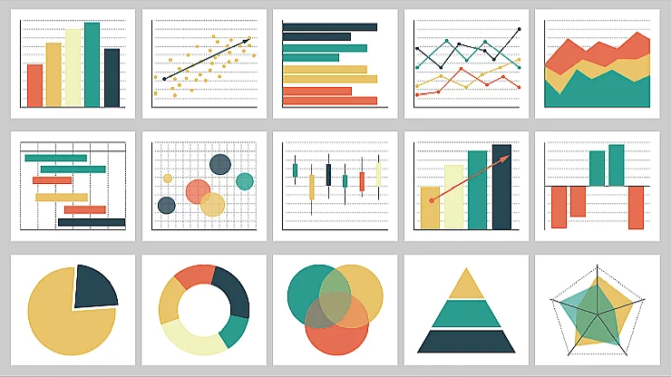
Data governs the world. We are swamped with data, whether it is from official statistical reports, market research data, politics, science, or analytics. As a result, the ability to communicate complex information effectively through visuals has never been more important. To help us with that, we can rely on the time-tested and proven seven principles of art and design and learn how they can help us improve our data visualizations.
As a result of information overload, data visualization is critical in assisting individuals and organizations in understanding, analyzing, and making informed decisions based on massive amounts of data. And, while the data itself can be very dynamic, appear in enormous quantities, and be very novel, there are time-tested artistic principles that can help us offer valuable insights and guidance when it comes to creative and informative visual representations.
Seven principles of art and design
We can drastically improve our designs by including art and design principles into our data visualization efforts, making them not only visually appealing but also more effective in conveying complex information. Those principles provide a solid foundation for designers and developers to create harmonious, balanced, and dynamic visualizations that capture attention and aid comprehension.
In this article, we will look at the seven principles of design and art and how they can be applied to data visualization.
Those principles are:
- Balance
- Contrast
- Emphasis
- Movement
- Proportion
- Rhythm
- Unity/Variety
By investigating these principles and comprehending their application in the world of data visualization, you will be able to create visualizations that are both visually appealing and effective in communicating your data.
In the following sections, you’ll learn about the relevance of seven principles of design to data visualization and then about each of those principles. Every one of those seven principles of design and art will be introduced and defined. You’ll also be able to find examples of those principles in famous artworks and then learn how they relate to data viz.
Finally, there’ll be some tips for how you can align with each of those principles in your work.
Let’s do this!
Relevance of design and art principles to data visualization
The worlds of art and data visualization may appear unrelated at first glance, but they share a common goal: to effectively communicate ideas and concepts through visual representation.
To convey meaning and evoke emotion, both art and data visualization rely on design elements like line, shape, color, and composition. We can harness the power of artistic techniques to create more engaging, clear, and aesthetically pleasing visualizations by understanding the relationship between design principles and data visualization.
The fundamental nature of visual communication explains the relationship between design principles and data visualization. Art principles provide a framework for organizing and manipulating visual elements in a composition to create harmony, balance, and a sense of order.
Similarly, data visualization aims to present complex information in an understandable and visually appealing manner. Including art and design principles into data visualization efforts enables designers to create graphics that not only look good but also communicate the underlying data and insights effectively.
In several ways, applying art and design principles to data visualization can significantly improve its effectiveness, as described in the following sections.
Enhanced visual appeal
Aesthetically pleasing visualizations are more likely to capture and maintain attention. When visualizations are appealing, viewers are more likely to spend time exploring the data, which leads to better understanding and engagement.
Improved clarity
Art principles can help us create visualizations that are more organized and coherent, making it easier for viewers to interpret the data. For instance, using principles like balance and contrast can help highlight important data points and relationships, making the visualization more informative.
Better communication of insights
All these principles can guide us in emphasizing key insights and telling a compelling story with our data. When we apply principles such as emphasis and movement, we can direct someone’s attention to the most critical aspects of the data, facilitating comprehension and promoting informed decision-making. This last element, informed decision-making, is critically important when trying to communicate ideas to various stakeholders.
Increased accessibility and user-friendliness
When we follow art principles, we can create visualizations that cater to a broader audience. Visualizations that follow principles like proportion and unity are more likely to be understood by viewers with varying levels of expertise in the subject matter, making the information more accessible and easier to understand.
To fully appreciate the potential benefits of applying art principles to data visualization, let’s go over each principle in depth and talk about how they can be used to create more effective and aesthetically pleasing visualizations.
Principle #1: Balance
Balance is a fundamental principle in art that refers to the distribution of visual elements within a composition, creating a sense of equilibrium and stability. It is crucial in art because it helps to create visual harmony, making the artwork more aesthetically pleasing and easier to understand. It can be achieved through various methods, such as symmetrical, asymmetrical, or radial balance, each providing a different visual effect.
In data visualization, balance can be achieved by ensuring that different elements, such as text, graphs, and images, are distributed evenly throughout the visualization. This can prevent the viewer’s eye from being drawn to one particular area, ensuring that all parts of the visualization receive equal attention. Proper balance also helps to maintain a sense of visual harmony, making the visualization more pleasing to the eye
Examples of famous artworks with balance as a principle of art

Leonardo da Vinci’s “The Last Supper” showcases symmetrical balance, with the central figure of Jesus Christ flanked by equally distributed figures and architectural elements on both sides.
Vincent van Gogh’s “Starry Night” painting demonstrates asymmetrical balance, with the swirling night sky balancing the dark, heavy forms of the village and the cypress tree on the right side of the composition.
Piet Mondrian’s “Composition with Red, Blue, and Yellow” plays with asymmetrical balance using a grid of black lines and three primary colors. The composition is carefully balanced with the arrangement of colored rectangles, demonstrating harmony and equilibrium through the use of geometric shapes and a limited color palette. We use this same image as an example in the last of seven principles in art (Unity and variety) later in this post.
How balance relates to data visualization
In data visualization, balance plays a crucial role in ensuring that the visual elements, colors, and text are distributed evenly throughout the design. A well-balanced visualization is more visually appealing and prevents the viewer’s eye from being drawn to one particular area, ensuring that all parts of the visualization receive equal attention. Achieving balance in data visualizations can help establish a sense of visual harmony, making the information more digestible and easier to understand.
Tips for achieving balance in data visualizations
Here are several tips on how you can achieve balance in your data visualizations. Regardless of the tool you are using to create them, these tips and principles are generally applicable.
Distribute visual elements evenly
To ensure that your data visualization is well-balanced and visually appealing, it’s essential to distribute design elements such as charts, graphs, text, and images evenly across the composition. This means avoiding the clustering of elements in one area, which can make the visualization look cluttered and disorganized.
Instead, aim to establish the flow and balance by giving each element adequate space and arranging them in a way that guides the viewer throughout the visualization. This can be achieved through the use of grids, margins, and white space to create a structured and organized layout.
Use symmetrical or asymmetrical balance
In data visualization, you can opt for either symmetrical or asymmetrical balance, depending on your data and the desired visual effect. Symmetrical balance, where elements are mirrored along a central axis, provides a sense of stability and order, making it suitable for visualizations that require a clear, straightforward presentation of data.
On the other hand, asymmetrical balance, where elements are arranged unevenly but still create an overall sense of equilibrium, can add visual interest and dynamic tension. This approach can be useful when dealing with diverse data sets or when trying to create a more engaging and visually intriguing design.
Balance color usage
Color plays a crucial role in data visualization, as it can help convey information and establish hierarchy. To maintain balance in your visualization, it’s important to distribute colors evenly and thoughtfully. Avoid using too many bright or bold colors in one area, as this can create a visual imbalance and distract the viewer from the overall message. Instead, use a harmonious color palette and consider employing color coding, saturation, or gradients to differentiate data points, emphasize specific aspects of the data, and maintain visual coherence.
Maintain consistency in text size and style
Consistency in text size and style is essential for creating balance in data visualizations. By using a uniform text size and style for headings, labels, and descriptions, you can prevent any one area from appearing more important or visually dominant than others. This consistency also aids in readability and helps the viewer quickly grasp the structure of the visualization.
To achieve this consistency, select a typeface and stick to a limited number of font styles, sizes, and weights. You can also use typographic hierarchy to differentiate between headings, subheadings, and body text, ensuring that each level of information is clear and distinct.
Adjust the visual weight of elements
Visual weight refers to the perceived importance or dominance of a visual element within a composition. Factors such as size, color, contrast, and complexity can affect an element’s visual weight. In data visualization, it’s essential to consider the visual weight of different elements (e.g., the size of shapes or the thickness of lines) and adjust them as needed to create a balanced composition.
For instance, if a particular chart or graph is visually dominant, you might consider reducing its size or adjusting its color to bring it into balance with the rest of the visualization. Similarly, if a specific data point or trend requires emphasis, you can increase its visual weight by enlarging it or using a contrasting color to make it stand out. By carefully adjusting the visual weight of various elements, you can create a harmonious and well-balanced data visualization.
Principle #2: Contrast
The difference between elements in a composition, such as colors, shapes, textures, or values, is referred to as contrast in art (light and dark). It is essential in art because it adds visual interest, creates focal points, and enhances the overall impact of a piece. High contrast draws attention to specific elements, making them stand out, whereas low contrast can produce a more subtle and harmonious effect. The use of contrast can guide the viewer’s eye and highlight important areas of the artwork.
Examples of famous artworks with contrast

Caravaggio’s “The Calling of Saint Matthew” is a prime example of the artist’s skillful use of chiaroscuro, a technique that employs strong contrasts between light and dark to create a dramatic effect. The stark contrast between the dark background and the brightly illuminated figure of Matthew helps to draw the viewer’s focus to the central narrative of the painting.
Caravaggio portrays Matthew, the tax collector, sitting at a table with four other men. Jesus Christ and Saint Peter enter the room, and Jesus is pointing to Matthew. A beam of light shines on the men at the table, who are gazing at Jesus Christ. One possible interpretation is that this is a moment of conversion and awakening, and the contrast used here makes it more dramatic and emphasizes it.
Iconic painting by Grant Wood, “American Gothic” is another excellent example. In this recognizable painting, contrast is evident in the juxtaposition of the two main characters, the stern-faced farmer and his daughter, against the Carpenter Gothic-style house in the background. The use of contrasting colors, such as the deep blue sky against the white house and dark clothing of subjects with the juxtaposition of geometric shapes and lines also contribute to the visual impact of the piece.
How contrast relates to data visualization
In data visualization, contrast is a valuable tool for emphasizing important data points or trends and guiding the viewer’s focus to key aspects of the information being presented. The effective use of contrast can make certain elements stand out, making it easier for the viewer to grasp the significance of specific data points or patterns. By using contrast strategically, designers can create visually engaging and impactful visualizations that effectively communicate complex data.
Tips for using contrast effectively in data visualizations:
Use contrasting colors
To effectively use contrast in your data visualization, choose colors with high contrast to highlight important data points or trends. To create the most contrast, use complementary colors (colors that are opposite each other on the color wheel). Using blue and orange together, for example, can make specific elements stand out.
You can also select colors with high contrast in terms of saturation (vibrancy) or value (light and dark). Using a bright color against a muted background or a light color against a dark background can draw attention to specific data points, making them more visible and understandable.
Vary line thickness and shape size
Within your visualization, varying the thickness of lines and the size of shapes can create contrast and draw attention to specific elements. Thicker lines can draw attention to key data points, whereas larger shapes can emphasize important trends or connections.
Consider how the size and thickness of lines and shapes in your visualization can be used to convey information effectively and create a visual hierarchy, guiding people’s focus to the most important aspects of the data.
Employ typographic contrast
Using different font styles, sizes, and weights can help establish hierarchy and guide focus within your text elements.
You can distinguish headings and subheadings from body text by using bold or italic styles, making it easier for the viewer to understand the structure of the visualization. Text size can also be used to create contrast, with larger text sizes used for more important information.
When using typographic contrast, keep readability in mind and avoid overcomplicating the design with too many different styles or sizes.
Use contrasting textures or patterns
Adding textures or patterns to your visualization can help create contrast between different sections or categories.
This technique is especially useful when dealing with categorical data or attempting to distinguish between overlapping data points. Using different fill patterns in a bar chart or pie chart, for example, can help differentiate between categories or groups, making the data more accessible and easier to interpret.
When using textures or patterns, keep clarity in mind and avoid creating visual clutter that may make the visualization difficult to understand.
Contrast in data representation
Using different chart types or data representation styles can help to create contrast in your visualization, making it easier for the viewer to differentiate between different data sets or trends.
Combining a line chart and a bar chart, for example, can help distinguish between two data sets or highlight one trend in relation to another. Alternatively, combining pie and bar charts can highlight differences between categories or groups.
Consider how the contrast between chart types or data representation styles can improve the viewer’s understanding of the data and create a more engaging and informative visualization when choosing chart types or data representation styles.
Principle #3: Emphasis
In art, the focal point or area of a composition that draws the viewer’s attention is referred to as the emphasis.
It is an important aspect of art because it allows the artist to direct focus to specific elements or themes within the artwork, creating a hierarchy of importance. Emphasis can be achieved through a variety of techniques such as contrast, color, size, placement, or texture, and it aids in the effective communication of the artist’s message.
Examples of emphasis in famous artworks
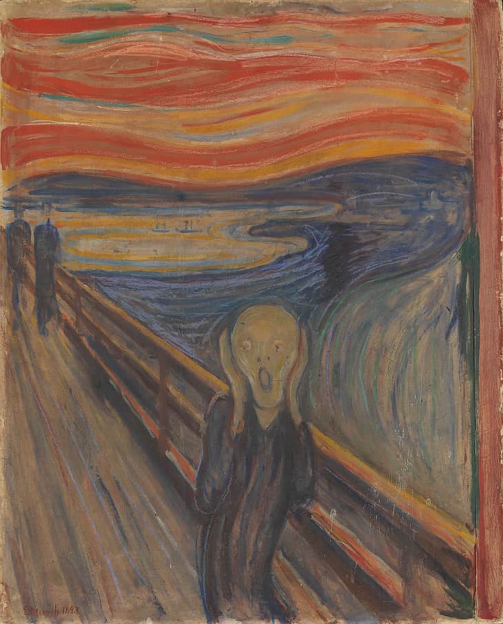
Edvard Munch’s “The Scream” uses color, shape, and line to create emphasis on the central figure’s face, expressing intense emotion. The swirling lines and contrasting colors surrounding the figure further draw the viewer’s emphasis to the subject’s anguish.
In “Girl with a Pearl Earring”, Johannes Vermeer uses contrast, color, and lighting to create emphasis on the girl’s face and the earring. The dark background contrasts with the light on her face, and the earring’s pearl stands out against the dark shadow, making it the focal point of the composition.
Frida Kahlo’s “Self-Portrait with Thorn Necklace and Hummingbird” relies on color and texture to emphasize her face in this self-portrait. The vivid colors of the flowers and the intricacy of the thorn necklace contrast with the muted background, making her face the focal point of the painting.
How emphasis relates to data visualization
In data visualization, emphasis is critical in emphasizing key insights or data points, ensuring that the viewer grasps the most important information quickly.
We can direct attention and create a visual hierarchy that makes the data more accessible and understandable by emphasizing specific elements within the visualization.
Tips for achieving emphasis in data visualizations
Use color strategically
Using bold or contrasting colors within your visualization can effectively highlight key data points or insights.
For example, if you have a bar chart displaying sales data, you could use a bright color to highlight the best-performing category. This points the focus to the most important information and allows them to grasp the main takeaway quickly.
Avoid using too many bright colors, as this can make the visualization cluttered and overwhelming.
Adjust size and scale
Increasing the size or scale of key elements in your visualization can draw attention to them and emphasize their importance.
In a scatter plot, for example, you could enlarge specific data points representing outliers or points of interest. This makes them more visible and easier to identify for the viewer.
Be careful not to distort the data or misrepresent the relationships between different elements when adjusting size and scale.
Employ visual hierarchy
Arranging elements in a clear hierarchy of importance ensures that the most important information is visually prominent.
You can acomplish this by using a variety of techniques, including layering elements, using contrasting colors, and adjusting size and scale.
In a dashboard with multiple charts and graphs, for example, prioritize the most important charts by placing them at the top or center of the layout, making them the first thing the viewer sees.
Utilize typography
Using larger font sizes, bold or italic styles, or contrasting colors in your visualization can help highlight headings, labels, or specific data points.
For example, you could use a larger font size and bold style for a chart’s title to make it clear what the chart represents. You could also use a contrasting color for labels associated with important data points or trends to help them stand out and be easier to read.
When using typography for emphasis, make sure that readability is maintained and that the design is not overcomplicated with too many different styles or sizes.
Add annotations or callouts
Annotations, callouts, and tooltips in your visualization can help draw attention to important data insights or trends.
These extra elements can provide context or explanations for specific data points, making the data more accessible and understandable.
A callout indicating a significant increase in revenue, for example, could be added to a line chart depicting a company’s revenue over time, along with a brief explanation of the contributing factors. Keep annotations and callouts brief and clear to avoid overwhelming the viewer or cluttering the visualization.
Principle #4: Movement
In art, movement refers to the visual flow or sense of motion created within a composition. It is significant because it aids in the movement of the viewer’s eye through the artwork, leading them from one element to the next and creating a sense of rhythm or dynamism.
We can achieve movement using a variety of techniques such as line, shape, color, or repetition, and it contributes to a piece’s overall visual impact and harmony.
Examples of movement in famous artworks
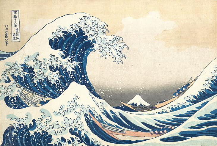
Hokusai’s “The Great Wave off Kanagawa”, a famous ukiyo-e woodblock print, uses dynamic lines, shapes, and repetition to invoke a sense of movement, conveying the power and energy of the ocean waves.
Marcel Duchamp’s “Nude Descending a Staircase, No. 1″ is a modernist icon combining elements of Cubism and Futurism to depict a figure in motion, using multiple overlapping images of the figure to create a feeling of movement through time and space.
How movement relates to data visualization
In data visualization, movement plays a crucial role in guiding the viewer through the information, making it easier to understand the relationships between different data points and trends.
By creating a sense of movement within the visualization, we can lead the viewer on a visual journey, revealing insights and telling a story with the data.
Tips for implementing emphasis as one of the seven principles in art in data visualizations
Use directional cues
In data visualizations, incorporating directional elements such as arrows, lines, or even object positioning helps guide the viewer’s eye. These cues effectively highlight data flow or relationships between different elements.
Using arrows in flowcharts, for example, clarifies the process flow and makes it easier for viewers to understand connections between different stages or steps. Using clear directional cues in the visualization simplifies the interpretation of complex relationships.
Arrange elements sequentially
Placing elements in a data visualization in a logical order that reflects the progression of time or the sequence in which information should be consumed can greatly improve comprehension.
A timeline chart, for example, arranges events chronologically, allowing viewers to easily follow the sequence of events. This approach ensures that viewers can easily digest the data in the intended order by creating a natural flow from one piece of information to the next.
Employ visual hierarchy
A data visualization that has a hierarchy of visual elements is more readable and effective. Begin by emphasizing the most important or eye-catching elements, then move on to secondary and tertiary elements.
This strategy guides the person through the visualization, ensuring that the most important information is displayed first.
For example, in a dashboard with multiple charts, you could place the primary charts in the center or at the top to grab your attention right away.
Utilize color and contrast
Using color and contrast effectively within a data visualization can build a sense of movement, guiding the viewer’s eye from one area to another. You can accomplish this by emphasizing key trends or data points with contrasting colors or shades.
In a bar chart displaying the performance of various products, for example, using a different color for the best-selling product will draw the viewer’s attention to that data point.
Color accessibility should be considered, and colors that are easily distinguishable for all users should be chosen.
Involve repetition and rhythm
The use of repetition and rhythm in data visualization improves its overall flow and coherence.
Repeating visual elements, such as shapes, colors, or patterns, will establish a sense of rhythm within the visualization, assisting the viewer’s eye in navigating the data. This method can reveal patterns or trends that would otherwise go unnoticed.
Using a consistent color for each product across all bars, for example, in a stacked bar chart displaying sales data for multiple products over time, will make it easier for viewers to identify and track the performance of individual products.
Leverage interactivity and animations
Implementing interactive elements and animations into your data visualization (if the medium and technology permit it) can significantly improve the sense of flow and movement, providing the viewer with a more engaging experience.
Users can explore the data at their own pace with interactive visualizations, revealing more information as they interact with the elements, whereas animations can help guide us through the data and highlight important trends or insights.
Using hover effects to display additional information or tooltips, for example, can encourage users to dig deeper into the data. Similarly, animating transitions between different views or data sets can produce a dynamic, flowing experience that aids the viewer in understanding how data points relate to one another over time or under different conditions.
Furthermore, the ability to drill down into data sets and tell data-driven stories can improve the sense of movement and flow in your data visualizations. You encourage viewers to interact with and explore the information more thoroughly by providing them with a clear narrative and the option to delve deeper into specific aspects of the data.
Drilling down into data sets can be accomplished using a variety of techniques, including interactive filtering, zooming, and selecting specific data points to reveal more detailed information.
These features allow viewers to narrow in on specific areas of interest, resulting in a more personalized and in-depth understanding of the data.
Principle #5: Proportion
Proportion in art refers to the relative size and scale of various elements within a composition. It is important because it helps establish harmony, balance, and realism in a piece. Proper proportion ensures that the elements of a composition relate to one another in a way that is visually pleasing and accurately represents the subject. In some cases, artists may deliberately manipulate proportions to create a specific effect or evoke a particular emotion.
Examples of proportion in famous artworks
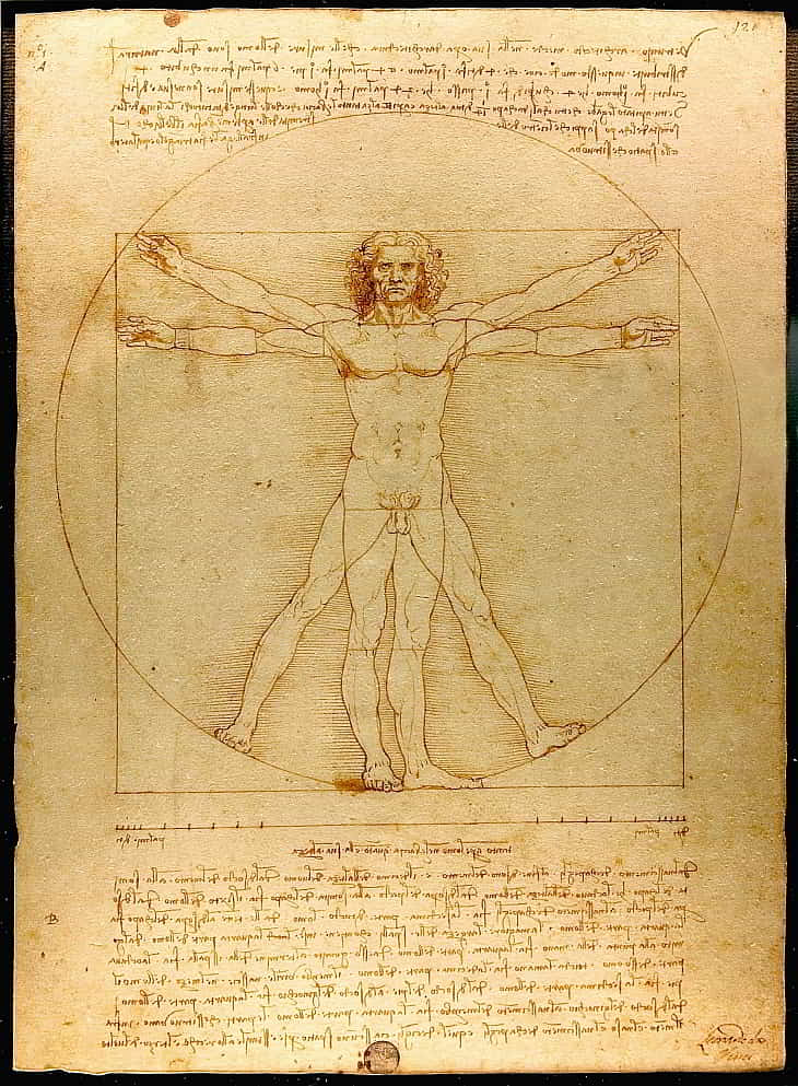
Leonardo da Vinci’s “Vitruvian Man” demonstrates the ideal proportions of the human body, based on the principles outlined by the ancient Roman architect Vitruvius. It serves as a visual representation of the harmonious relationship between parts of the human form.
Michelangelo’s “David” is a famous sculpture renowned for its accurate and idealized proportions, which contribute to its sense of balance and beauty. The larger-than-life size of the sculpture also creates a sense of awe and grandeur.
How proportion relates to data visualization
In data visualization, proportion is crucial for accurately representing data scales and relationships.
Properly scaled visual elements ensure that the viewer can easily interpret the information and make valid comparisons between different data points or trends. Misrepresenting proportions in a visualization can lead to incorrect conclusions and undermine the credibility of the data.
Tips for maintaining proper proportion in data visualizations
Choose appropriate chart types
Choosing the appropriate chart type is critical for maintaining proper proportions and accurately representing the data.
Bar charts, for example, are ideal for comparing discrete categories because they clearly show magnitude differences between data points. Line charts, on the other hand, are better for displaying trends over time because they visually connect data points in chronological order, making patterns and fluctuations easier to identify.
You can ensure that proportions are accurately maintained and your visualization is effective by carefully selecting the chart type that best suits the data you’re working with.
Use consistent scales
It is critical to use consistent scales when creating a data visualization, both within individual charts and across multiple charts. Consistent scales aid viewers in making accurate comparisons and prevent confusion due to varying scales. When comparing revenue data for different products, for example, using the same currency units and scale range ensures that viewers can accurately assess the differences.
Additionally, using consistent scales across charts when creating a dashboard with multiple charts allows viewers to easily compare and contrast various data points.
Avoid distortion
Certain visual elements can distort proportions, and cause misinterpretation of data. When using 3D charts, be cautious because they can introduce visual distortion and make it difficult for viewers to accurately assess the data. Similarly, certain data transformations, such as using logarithmic scales, can cause confusion if viewers are unfamiliar with the transformation.
Prioritize clarity and simplicity when creating a visualization to ensure that the data is presented accurately and without distortion.
Consider relative, absolute, and logarithmic scales
When representing data, it’s important to consider which scale is most suitable for your visualization: relative scales (e.g., percentages), absolute scales (e.g., raw numbers), or logarithmic scales.
Each scale has its own unique applications and benefits, depending on the data being presented and the intended audience.
- Relative scales can be useful for comparing proportions and ratios. For instance, when visualizing market share data, using a relative scale (percentages) allows viewers to quickly understand each company’s share of the market. This approach helps highlight the relationships between different entities in terms of their relative contributions.
- Absolute scales are better for showcasing exact values and may be more appropriate when presenting sales figures or other raw numbers. For example, when visualizing a company’s revenue growth over time, an absolute scale can convey the precise revenue generated, helping viewers understand the exact magnitude of the changes.
- Logarithmic scales are particularly useful when dealing with data that spans several orders of magnitude, making it challenging to visualize using linear scales. By transforming the data using a logarithmic function, you can compress the scale and reveal patterns or relationships that may otherwise be obscured. Logarithmic scales can be especially helpful when visualizing data with exponential growth, such as population growth or viral spread patterns.
Example
For example, imagine you’re visualizing the revenue of various tech companies, where some have annual revenues in the billions, while others have revenues in the millions or even thousands. A linear scale would make it difficult to discern differences between smaller companies, as the larger ones would dominate the visualization. By using a logarithmic scale, you can effectively represent the data, making it easier to compare companies across different revenue tiers.
When choosing a scale for your data visualization, it’s essential to consider which option will best represent the relationships between data points and provide the most meaningful context for your audience. By selecting the right scale, you can create a more effective and informative visualization.
Principle #6: Rhythm
In art, rhythm refers to the regular repetition or pattern of visual elements, such as shapes, colors, or lines, that enhance the feeling of movement, harmony, and flow in a composition.
It’s an essential principle because it helps guide people through the artwork, making it more engaging and visually appealing.
Rhythm can convey a sense of energy, dynamism, or stability, depending on the pattern and repetition used.
Examples of rhythm in famous artworks
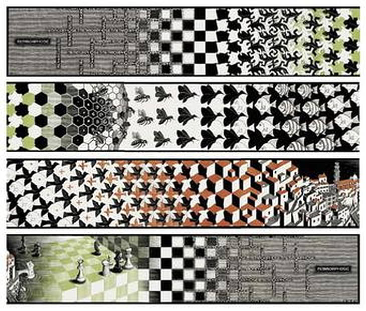
M.C. Escher’s “Metamorphosis II” piece features a grid-like pattern that transforms from one shape to another, creating a sense of rhythm and flow as the viewer’s eye follows the progression of the pattern.
Vincent van Gogh’s “Starry Night” relies on swirling, repetitive brushstrokes in the sky to deliver a feeling of rhythm and movement, guiding the viewer through the composition.
How rhythm relates to data visualization
In data visualization, rhythm can help make information more effective and visually appealing. Rhythm can guide you through the data by incorporating patterns or repetition of visual elements such as shapes, colors, or lines.
This makes the data easier to understand and interpret. Rhythm can also create visual harmony, making the visualization more visually appealing and engaging.
Tips for incorporating rhythm as on the of the seven principles in art in data visualizations
Use repetition of visual elements
Incorporating repeated shapes, colors, or patterns in your data visualization can establish a sense of rhythm, making it easier for viewers to follow and understand the presented information. For example, repeating colors in a line chart to represent different categories can help create visual consistency, guiding the viewer through the trends.
Similarly, using repeated shapes or icons for data points in a scatterplot can establsih rhythm and make it easier to identify clusters or trends within the data.
Apply consistent spacing
Ensuring that visual elements are consistently spaced throughout your visualization contributes to a sense of rhythm and harmony. Consistent spacing helps viewers understand the relationships between different elements, making it easier to compare and interpret the data.
For instance, maintaining equal distances between bars in a bar chart or columns in a table ensures that the viewer can quickly grasp the relationships between data points and notice any patterns or anomalies.
Utilize gridlines or background patterns
Incorporating gridlines or subtle background patterns in your data visualization can create a rhythmic structure that helps organize the data and guide the viewers through the information. Gridlines can provide a visual reference for interpreting data points, while background patterns can help differentiate between various sections or categories within the visualization.
For example, using alternating background colors in a table can create a visual rhythm that makes it easier for the viewer to read and interpret the data.
Coordinate visual hierarchy
Creating a visual hierarchy that emphasizes important data points or trends while maintaining a sense of rhythm and flow is essential for effective data visualization. By strategically using size, color, or position to highlight critical information, you can guide the viewer’s attention to the most important aspects of the data without disrupting the overall visual rhythm.
You could use bold colors to emphasize key data points in a scatterplot while keeping the overall pattern of data points consistent can draw attention to crucial insights without compromising the visualization’s harmony.
Experiment with animation
If suitable for your project, consider using animation to create a sense of movement and rhythm in your data visualization. Animated visualizations can help guide the viewer’s eye through the data, making it easier to follow trends or insights as they unfold over time. For instance, animating a line chart to show changes in a data series over time can create a sense of rhythm, allowing viewers to see the progression of the data and better understand its implications.
Additionally, using animation to transition between different views or representations of the data can create a more engaging and dynamic experience for the viewer.
Principle #7: Unity and variety
Unity in this context refers to the sense of cohesion and harmony among the elements of a composition, creating a visually pleasing and coherent whole.
On the other hand, variety is the inclusion of diverse visual elements, such as shapes, colors, and textures, to add interest and complexity to a composition.
Both unity and variety are essential in art, as they work together to create a balanced and engaging visual experience.
Examples of unity and variety in famous artworks
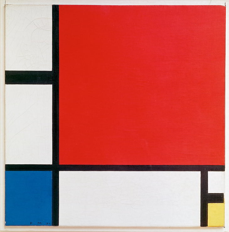
Piet Mondrian’s “Composition with Red, Blue, and Yellow” is an example of unity through the use of simple geometric shapes, a limited color palette, and consistent line weight.
Jackson Pollock’s “No. 5, 1948” demonstrates variety through the use of various colors, line thicknesses, and the chaotic arrangement of paint drips and splatters, while still achieving a sense of unity through the overall composition and movement.
How unity and variety relate to data visualization
In data visualization, unity and variety play a vital role in creating engaging and effective visual representations of data. Unity helps ensure that the visualization is easily understood and cohesive, while variety adds visual interest and helps communicate the diversity and complexity of the data.
By incorporating a balance of unity and variety, designers can create data visualizations that are both aesthetically pleasing and informative.
Tips for incorporating variety in data visualizations while maintaining unity
Use a consistent color scheme
Maintaining unity and variety in data visualizations requires a well-designed color scheme. Choose a small number of complementary colors and use them consistently throughout your visualization to represent specific categories or data points. If you’re visualizing sales performance data, you could use different shades of blue to represent each sales region, with contrasting colors like orange or red to highlight targets or exceptional performance.
Maintain visual consistency
Different chart types, shapes, and visual elements will add to variety. However, it is critical that these disparate elements share common design elements such as line weight, font style, or color.
Consider this: if you are using bar charts, pie charts, and line charts in the same visualization, ensure that the line weights, fonts, and colors are consistent across all charts to create a sense of unity and cohesion.
Balance complexity and simplicity
A successful data visualization will strike a balance between the complexities of the data being represented and the brevity of the visual elements used to represent it.
However, keep this in mind:
- Too much variety can overwhelm or make the visualization difficult to interpret.
- Too much unity, on the other hand, may make it appear dull or uninformative.
To achieve this balance, carefully consider which elements to include in the visualization and how to present them in a clear and concise manner while maintaining visual interest.
Group related elements
Organize similar or related elements in close proximity to one another to increase unity and variety.
For example, if you’re presenting data on customer demographics, you might group data points related to age, gender, and location together while visually distinguishing them from data points related to purchasing habits or product preferences. This method creates a sense of unity among related elements while allowing for variation in the overall visualization.
Establish a visual hierarchy
Using a visual hierarchy to guide the viewer through the data is an effective way to ensure that the most important information is easily accessible while still incorporating variety in the presentation of supporting data.
Use size, color, and position to emphasize key data points or trends while visually subordinating secondary and tertiary data.
Here’s a simple idea – use large, bold font labels for the most important insights, while you can use smaller font sizes and lighter colors for less important details. This approach promotes unity by establishing a clear hierarchy of information while still allowing for variation in data presentation.
Conclusion
The importance of incorporating art principles into data visualization is obvious.
We can create visualizations that are not only aesthetically pleasing but also effective at communicating complex information by applying these principles.
The seven principles in art discussed in this article—balance, contrast, emphasis, movement, proportion, rhythm, and unity and variety—provide useful guidance for improving the design and impact of data visualizations.
I encourage you to use these art principles as you embark on your own data visualization projects. They will help you create visually engaging, clear, and informative representations of your data. You will not only improve the aesthetics of your visualizations, but you will also improve their effectiveness in communicating the stories hidden within your data.
Remember that the ultimate goal of data visualization is to make complex information more accessible and understandable. These seven principles in art and design will help you get there.
So, experiment with these principles to see how they can propel your data visualization efforts to new heights.
Here’s how you can support viborc.com
We hope you like our content and this post about seven principles in art and design. You can support us in several ways. If you use ad-blocking software, please consider adding us to a safelist.
When sharing our content, please link back to the source. When sharing on Instagram, please tag @viborccom. The same is for Twitter (@viborccom).
Thanks! Hvala! Danke! Дякую!
ABOUT THE AUTHOR
")


")


