Archive · Data Visualization Craft
Inflation data visualization tutorial and a case study
Explore inflation data visualization tutorial and case study to enhance your skills in portraying economic data effectively and accurately.
When I initially took on the task of visualizing inflation data across Europe, the color scheme seemed apt.
However, as I shared my work, the Reddit community was quick to point out the shortcomings. The feedback was a wake-up call, nudging me to go deeper and refine my approach.
This experience, although humbling, has been immensely enlightening. Now, with a more refined understanding and a revised color scheme, I aim to share the knowledge acquired and the improvements made with the broader community.
How to visualize inflation data, properly?
This article unfolds as a practical guide, a tutorial, and a case study rolled into one. I hope it is useful for both novices and seasoned practitioners in the domain of data visualization.
It chronicles the journey of refining a color scheme to represent inflation data across Europe. It's also shedding light on the crucial interplay between color choices and data accuracy, and the profound impact it has on the clarity and effectiveness of the visual narrative.
The feedback was a blend of critique and constructive insights. Key points highlighted were the overlooking of the 2% benchmark and the lack of nuanced color transitions indicating the severity of different inflation rates.
For example, the abrupt shift from green to red at 10% was seen as an oversimplification, not doing justice to the nuanced progression of inflation severity. In retrospect, a fair point.
The initial stance - too lenient towards high inflation rates
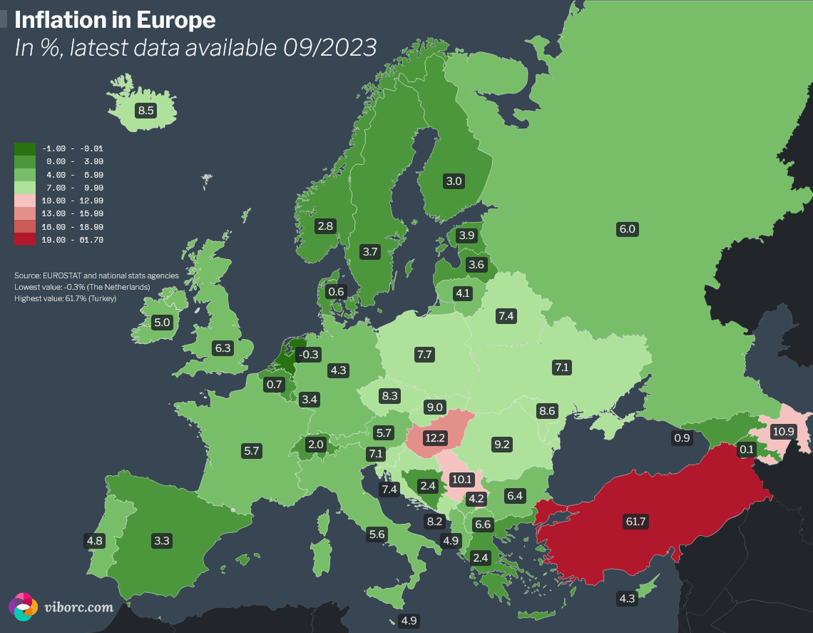
The initially chosen color palette initially seemed to provide a straightforward narrative: a green spectrum for inflation rates from -1% to 9.99%, transitioning to red for rates 10% and above. "Double-digit" inflation rates as a media buzzword drove this decision.
The thought process was to mirror a typical red-green scale, where green indicates 'go' or safe zones, and red indicates 'stop' or danger zones. However, a deeper dive revealed that this simplistic color scheme was glossing over some crucial nuances of inflation data.
Oversights and misrepresentations
Ignoring the 2% benchmark
The first glaring oversight was the disregard for the globally recognized 2% target inflation rate. By not differentiating the 2% target rate from other rates within the broad green spectrum, the visualization misrepresented a crucial economic benchmark.
This misrepresentation could potentially impact and mislead policymakers, stakeholders, or the general public about the economic implications of varying inflation rates.
Broad green spectrum
The extensive use of green for a wide range of inflation rates oversimplified the data narrative. It erroneously suggested that an inflation rate of 9.99% was almost as acceptable as rates closer to the 2% target.
A more graduated color scheme could have provided a clearer indication of the increasing severity as inflation rates moved further away from the 2% target.
Abrupt transition
The sudden shift from green to red at the 10% mark didn’t capture the nuanced differences between inflation rates in the higher single digits and those in the lower double digits.
A more graduated transition could have highlighted the escalating severity of inflation rates, providing a better visual cue for interpretation.
The feedback and self-reflection brought to light the necessity for a color scheme that better encapsulates the intricacies of inflation rates. It was clear that a more nuanced, graduated, and economically aligned color scheme was imperative to provide a clear, accurate, and insightful visual narrative of the inflation scenario across Europe.
And that's what I did. Here's how.
The revised palette as a spectrum of understanding
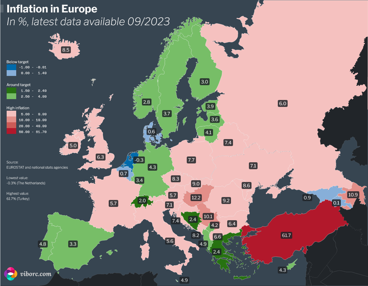
The journey towards refining the color scheme for visualizing inflation data led to a more nuanced and insightful depiction of the economic landscape. Each color range in the revised scheme is meticulously tailored, not just to provide visual appeal, but to encode the economic theory underlying inflation rates into a visual narrative that's intuitive and insightful.
Incorporating economic benchmarks
Recognition of 2% target
By earmarking a specific shade of green for the near-target range of 1.5% to 2.49%, the revised scheme now aligns with the globally recognized 2% target inflation rate. This precise color demarcation helps in visually distinguishing the desirable inflation rate zone from the others. It helps achieve higher precision in representation.
This alignment with a critical economic benchmark enhances the accuracy of the data narrative, enabling a more informed interpretation of the inflation scenario.
Defining high inflation
The introduction of red shades as inflation rates approach and exceed 10% acts as a visual alert. It's an intuitive indication of escalating concern, providing a clear demarcation of the shift from moderate to high inflation rates.
This gradual transition in color provides a visual cue to the escalating severity of inflation. It's making the data narrative more insightful and easier to interpret.
Visual perception and color theory
Blue for cooler rates (and deflation)
Utilizing shades of blue for deflation and rates closer to deflation is metaphorically resonant. It aligns with the perception of blue as a 'cool' color. It visually communicates the idea of an economy cooling down.
The color blue is often associated with calmness and caution. It is subtly guiding the viewer to interpret these rates with a different lens compared to higher, more alarming rates. Although, it must be noted that deflation is a serious economic issue and not something "calm".
Red for overheating
The transition to shades of red for higher inflation rates is more than just a color choice; it's a visual warning. Red, often associated with danger or alert, intuitively communicates the notion of an 'overheating' economy, making the visualization more effective.
By associating the 'hotter' red shades with high inflation rates, the color scheme maintains a narrative consistency . As such, it aligns with common color perceptions, thus enhancing the intuitive understanding of the data.
The refinements in the color scheme are a testament to the continuous quest for better data representation. By intertwining economic theory with visual perception and color theory, the revised color scheme not only presents data but tells a more accurate and insightful story of Europe’s inflation scenario.
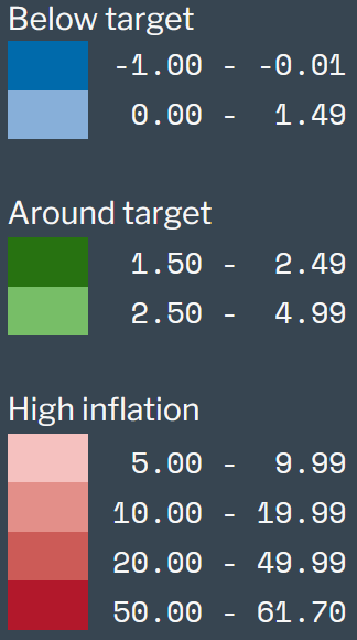
Streamlining the legend - creating a guided interpretation
Having refined the color scheme to better reflect economic benchmarks and visual perception principles, the next step was to ensure that the legend effectively guides the audience through the data narrative.
Here's the rationale for this division.
Below target (Blues)
Reflecting the cooler, calmer economic scenario where inflation rates are below the desired target, the blue shades in the legend provide a visual cue of an economy in a deflationary state or near(ing) deflation.
Around target (Greens)
The green shades symbolize the range of inflation rates that hover around the globally accepted target of 2%. This category reassures that the economy is functioning within a desirable inflation range, promoting stability and growth.
Above target / High inflation (Reds)
Representing the hotter, more alarming scenario, the red shades in the legend signify inflation rates that have surpassed the target. They are indicating an overheating economy. This part of the legend visually communicates the urgency and the escalating concern associated with higher inflation rates.
By delineating the legend into these three descriptive categories, the visualization now offers a structured guide. As such it is helpful for interpreting the color-coded inflation data. This categorization not only enhances the clarity and accessibility of the data but also enriches the educational value of the visualization. It is also providing a clear context for understanding the broader economic implications of varying inflation rates.
Lessons and tips for inflation data visualization
Effort to refine the color scheme for visualizing inflation data has been as enlightening as it has been challenging.
Here are some critical takeaways and tips that can serve as a guide in your data visualization journey:
Align with economic benchmarks
- Recognize standard benchmarks - Adhere to globally recognized economic benchmarks to ensure your visualization communicates accurate and meaningful insights. In our case, recognizing the 2% target inflation rate was crucial.
- Research and understand the data - Before diving into visualization, take time to thoroughly understand the data, its context, and the economic theory underpinning it. This understanding is foundational to creating a meaningful visualization.
- Consult with experts or relevant sources -If possible, consult with economic experts to gain a deeper understanding of the data and ensure your visualization is grounded in sound economic theory.
Craft nuanced transitions
- Avoid abrupt transitions - Ensure your color scheme has nuanced transitions to accurately represent the data's intricacies. Abrupt color changes can mislead interpretation, especially in complex datasets with closely related values.
- Employ gradual color transitions - Utilize gradual color transitions to depict a progressive change, helping viewers to intuitively understand the escalation or de-escalation of values.
Leverage color perception and legend categories
- Utilize intuitive color associations -Leverage colors that intuitively align with the data’s narrative. For example, using cooler colors like blue for lower values and warmer colors like red for higher values can reinforce the data's message.
- Test color perceptions - Before finalizing, test your color scheme with a diverse audience to ensure the colors are perceived as intended and the visualization is effective across a broad spectrum of viewers.
- Employ descriptive legend categories - Categorizing the legend into descriptive sections provides a structured guide for interpreting the data. This helps in narrating a clear story and directing the viewer's attention to critical parts of the data. For instance, categorizing the inflation rates as "Below Target," "Around Target," and "Above Target / High inflation" in the legend makes the narrative more intuitive and guides the audience through the varying levels of inflation across different regions.
- Maintain consistency in legend categories - Ensure that the categorization in the legend is consistent with the color scheme and the data narrative. This consistency between color, category, and data reinforces the narrative, making the visualization more coherent and easier to understand.
- Use clear, understandable terminology - When creating categories in the legend, use terminology that is easily understandable, avoiding jargon that could alienate or confuse the audience. This will help in making the visualization accessible to a broader audience, irrespective of their background knowledge.
Enhance accessibility
- Ensure color accessibility - Implement a color scheme that is accessible to individuals with color vision deficiencies. Utilize online tools to test the color scheme for accessibility.My visualization comes with challenges in this aspect. While the colors green and red are traditionally used, they may not be perceived as intended by everyone. In future iterations of the visualization, integrating patterns or textures along with color variations can significantly improve accessibility. Patterns or textures provide an additional visual cue that can help convey the data's message to individuals with color vision deficiencies.
- Provide clear legends - Include clear and concise legends that explain the color scheme and any other visual encodings used in the visualization. This will help ensure your visualization is understandable to a broad audience.
Continual iteration and feedback
- Seek feedback - Seek feedback on your visualization from both experts and laypeople. Their insights can provide valuable perspectives that may uncover areas for improvement.
- Iterative refinement - Data visualization is an iterative process. Don’t hesitate to go back to the drawing board and make refinements to enhance clarity, accuracy, and insightfulness.
- Stay updated - Economic scenarios and data interpretations can evolve over time. It's essential to keep updated with the latest developments and be ready to revise your visualizations accordingly.
Utilize advanced visualization tools
- Explore advanced tools - Employ advanced visualization tools and libraries that allow for more complex and nuanced color schemes and visual encodings. Moreover, tools like D3.js can provide more control and flexibility in designing your visualization.
- Interactive visualizations - Consider creating interactive visualizations that allow viewers to explore the data in more depth. Interactive features can provide additional insights and make your visualization more engaging.
The path to clarity
The pathway to mastering data visualization is a continual learning journey. Each project unveils new challenges and learning opportunities. Embrace the process, continually seek feedback, and strive for a balance between aesthetic appeal, accuracy, and clarity. Through attention to detail and an open-minded approach to learning and improvement, you can significantly enhance your ability to communicate complex data insights through visualization.
This endeavor has underscored the significance of being open to feedback, even when it's humbling. It's a reminder that the goal is to convey a clear and accurate message to the audience, not just create a visually pleasing output. The initial color scheme for visualizing inflation data across Europe, although aesthetically coherent, lacked in providing a precise narrative. The feedback received was instrumental in refining the color scheme to better align with economic benchmarks and visual perception principles.
Moreover, it's not just about creating solutions for personal satisfaction or aesthetic appeal. It's about crafting visual narratives that resonate with accuracy and clarity to a broader audience. The exercise of revising the color scheme has reaffirmed the value of color in effectively conveying complex economic scenarios in a simple, intuitive manner.
As we have navigated through the nuances of color choices and their implications in representing inflation data, the journey has been enriching. It's a testament to the continual quest for clarity and precision in data representation.
Ethical considerations of data visualization
For those keen on delving further into the ethics and related challenges, we have compiled a full guide about the ethics and ethical principles of data visualization that could serve as a useful resource.
In conclusion, the revised color scheme is not merely a design improvement, but a stride towards a more accurate and insightful representation of economic data. Through this exercise, the profound impact of color in data visualization, and the importance of an open, feedback-driven approach in refining visual narratives has been vividly demonstrated.
Here's how you can support us
We hope you like our content. You can support us in several ways. If you use ad-blocking software, please consider adding us to a safelist. When sharing our content, please link back to the source. When sharing on Instagram, please tag @viborccom. The same is for Twitter (@viborccom).
Thanks! Hvala! Danke! Дякую!