Tutorials and guides
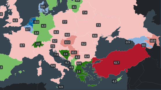
Inflation data visualization tutorial and a case study
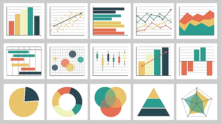
Data visualization stands at the intersection of analysis and art, rendering numbers into visual narratives that can be swiftly and clearly understood. The colors, shapes, and structures used in a visualization are more than aesthetic choices; they are the vocabulary of the narrative, each contributing to the clarity, accuracy, and effectiveness of the story being told.